UI Elements
Buttons
Basic
Bootstrap includes six predefined button styles, each serving its own semantic purpose..
Outline
Replace the default modifier classes with the .btn-outline-* ones to remove all background images and colors on any button.
Rounded
Use class .btn-rounded for button round.
Tags
The .btn
classes are designed to be used with the <button> element.
However, you can also use these classes on <a> or <input> elements (though
some browsers may apply a slightly different rendering).
Sizes
Add .btn-lg or .btn-sm for additional sizes.
Badges
Basic
Add any of the below mentioned modifier classes to change the appearance of a badge.
Pill
Use the .rounded-pill modifier class to make badges more rounded.
Badges in Buttons
Badges can be used as part of links or buttons to provide a counter.
Badges Position Examples
Example of Badges Position
Dropdowns
Basic
Any single .btn can be turned into a dropdown
toggle with some markup changes. Here’s how you can put them to work
with either <button>
elements:
Variant
The best part is you can do this with any button variant, too:
Split Button
The best part is you can do this with any button variant, too:
Sizing
Button dropdowns work with buttons of all sizes, including default and split dropdown buttons.
Dropup Variation
Trigger dropdown menus above elements
by adding .dropup to the parent
element.
Menu Alignment
Add .dropdown-menu-end
to a .dropdown-menu to right
align the dropdown menu.
Dropright Variation
Trigger dropdown menus at the right of the elements by adding .dropend to the parent element.
Dropleft Variation
Trigger dropdown menus at the left of the elements by adding .dropend to the parent element.
Images
Rounded & Circle
Use classes
.rounded and .rounded-circle.
Thumbnails
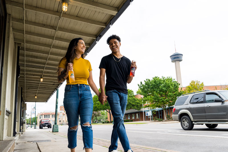
In addition to our border-radius utilities, you can use
.img-thumbnail to give an image a
rounded 1px border appearance.
Sizes
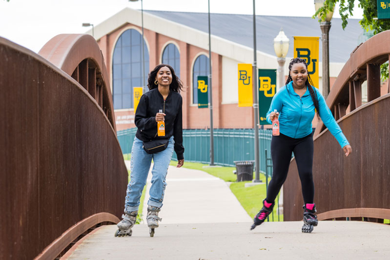
.avatar-sm
.avatar-md
.avatar-lg
.avatar-sm
.avatar-md
.avatar-lg
Cards

Card title
Some quick example text to build on the card title and make up the bulk of the card's content.
Button
Card title
Some quick example text to build on the card title and make up the bulk of the card's content.
- Cras justo odio
- Dapibus ac facilisis in

Card title
This is a wider card with as a to additional content.
Last updated 3 mins ago
Card title
This is a wider card with as a to additional content.
Last updated 3 mins ago

Primary Card
If several languages coalesce, the grammar of the resulting individual
Success Card
If several languages coalesce, the grammar of the resulting individual
Info Card
If several languages coalesce, the grammar of the resulting individual
warning outline Card
card title
If several languages coalesce, the grammar of the resulting individual
Danger outline Card
card title
If several languages coalesce, the grammar of the resulting individual
Success Card
card title
If several languages coalesce, the grammar of the resulting individual
Tabs & Accordions
Basic Tabs
Example of Default Nav Tabs
Raw denim you probably haven't heard of them jean shorts Austin. Nesciunt tofu stumptown aliqua, retro synth master cleanse. Mustache cliche tempor, williamsburg carles vegan helvetica. Reprehenderit butcher retro keffiyeh dreamcatcher synth. Cosby sweater eu banh iphone. Seitan aliquip butcher voluptate nisi qui.
Food truck fixie locavore, accusamus mcsweeney's marfa nulla single-origin coffee squid. Exercitation +1 labore velit, blog sartorial PBR leggings next level wes anderson artisan four loko farm-to-table craft beer twee. Qui photo booth letterpress, aesthetic magna delectus.
Etsy mixtape wayfarers, ethical wes anderson tofu before they sold out mcsweeney's organic lomo retro fanny pack lo-fi farm-to-table readymade. Messenger bag gentrify pitchfork tattooed craft beer, iphone skateboard locavore carles etsy mi whatever gluten yr.
Trust fund seitan letterpress, keytar raw denim keffiyeh etsy art party before they sold out master cleanse gluten-free squid scenester freegan cosby sweater. Fanny pack portland seitan DIY, art party locavore wolf cliche high life echo park Austin. Cred vinyl keffiyeh DIY salvia farm-to-table VHS.
Basic Nav Pills
Example of Default Nav Pills
Raw denim you probably haven't heard of them jean shorts Austin. Nesciunt tofu stumptown aliqua, retro synth master cleanse. Mustache cliche tempor, williamsburg carles vegan helvetica. Reprehenderit qui irure terry richardson ex squid. Aliquip placeat salvia cillum iphone. Seitan aliquip quis cardigan american apparel
Food truck fixie locavore, accusamus mcsweeney's marfa nulla single-origin coffee squid. Exercitation +1 labore velit, blog sartorial PBR leggings next level wes anderson artisan four loko farm-to-table craft beer twee. Qui photo booth letterpress, vinyl cillum PBR. Homo nostrud organic labore
Etsy mixtape wayfarers, ethical wes anderson tofu before they sold out mcsweeney's organic lomo retro fanny pack lo-fi farm-to-table readymade. Messenger bag gentrify pitchfork tattooed craft beer, iphone skateboard locavore carles etsy Leggings gentrify squid 8-bit cred pitchfork
Trust fund seitan letterpress, keytar raw denim keffiyeh etsy art party before they sold out master cleanse gluten-free squid scenester freegan cosby sweater. Fanny pack portland seitan DIY, vinyl keffiyeh DIY salvia PBR, banh mi before they sold out farm-to-table.
Accordions
Extend the default collapse behavior to create an accordion.
Modals
Basic
Toggle a working modal demo by clicking the button below. It will slide down and fade in from the top of the page.
Optional Sizes
Modals have three optional sizes, available via modifier classes to be placed on a .modal-dialog.
Vertically Centered
Add .modal-dialog-centered to .modal-dialog to vertically center the modal.
Scrollable
You can also create a scrollable modal that allows scroll the modal body by adding .modal-dialog-scrollable to .modal-dialog.
Static Backdrop
When backdrop is set to static, the modal will not close when clicking outside it. Click the button below to try it.
Pagination
Basic
Pagination links indicate a series of related content exists across multiple pages.
Sizing
Add .pagination-lg or .pagination-sm for pagination additional
sizes.
Progress
Basic
Progress components are built with two HTML elements, some CSS to set the width, and a few attributes.
Heights
We only set a height value on the .progress-bar, so if you change
that value the outer .progress
will automatically resize accordingly.
Striped & Animated
Add .progress-bar-striped
to any .progress-bar to apply a
stripe via CSS gradient over the progress bar’s background color.
Tooltips & Popovers
Tooltips
Hover over the links below to see tooltips.
Popovers
Add small overlay content, like those found in iOS, to any element for housing secondary information.
Spinners
Border
Use the border spinners for a lightweight loading indicator.
Color variation
Add text-* color for a Spinner color variation.
Growing
Switch to the grow spinner.it does repeatedly grow Continue!
Color Variation
Add text-* color for a Spinner color variation.
Grid
See how aspects of the Bootstrap grid system work across multiple devices with a handy table.
|
xs <576px |
sm ≥576px |
md ≥768px |
lg ≥992px |
xl ≥1200px |
xxl ≥1400px |
|
|---|---|---|---|---|---|---|
| Grid behavior | Horizontal at all times | Collapsed to start, horizontal above breakpoints | ||||
| Max container width | None (auto) | 540px | 720px | 960px | 1140px | 1320px |
| Class prefix | .col- |
.col-sm- |
.col-md- |
.col-lg- |
.col-xl- |
.col-xxl- |
| # of columns | 12 | |||||
| Gutter width | 24px (12px on each side of a column) | |||||
| Custom gutters | Yes | |||||
| Nestable | Yes | |||||
| Offsets | Yes | |||||
| Column ordering | Yes | |||||
Video
Responsive Embed Video 16:9
Aspect ratios can be customized with modifier classes.
Responsive Embed Video 21:9
Aspect ratios can be customized with modifier classes.
Responsive Embed Video 4:3
Aspect ratios can be customized with modifier classes.
Responsive Embed Video 1:1
Aspect ratios can be customized with modifier classes.